Hi,
This is an excellent article on the use of words by Magritte from Washington EDU:
1.1 Images of Resemblance: Magritte's semiotic explorations
What one must paint is the image of resemblance—if thought is to become visible in the world.
—Rene Magritte
The re-introduction of words into paintings and collages was a widely practiced transgression throughout the twentieth century avant-garde, as for example in Conceptualism, Dada, Cubism, or Futurism. In the case of Rene Magritte, words/images was the subject of numerous "experiments" in the later 1920s, some of which are among his best known works. In the early 1920s, Magritte had been trying out different styles when he discovered Giorgio De Chirico's work. These canvases, painted during World War I, excited a number of young painters who came to call themselves surrealists. Clearly Magritte was taken with De Chirico's incongruous juxtapositioning of "significant objects" with portentous titles ("The Philosopher's Conquest," "The Disquieting Muse," "The Double Dream of Spring," etc.) but saw them calling forth a basically literary process of meaning-making. [3] This on the one hand led to a shocked sense that poetry was ascendant over painting; on the other, it stimulated a feverishly productive period of including words in pictures in various ways and comparing words and images as means of representation.
His was a clear, narrow and quite abstract focus: he was not interested in typography or visual design, for example, nor in the visual and material qualities of writing (or calligrams, for that matter). [4] His interest was in probing how words and images differ in their modes of signifying. During the most intense part of this pursuit, from 1927-1929, he painted dozens of canvases, sometimes several with the same name, varying one signifying parameter or another, and he continued to visit the theme in later years. Two of these paintings provide the bookends—the first and last images—for John Berger's famous Ways of Seeing : the first is one version of the "key to dreams" series and the last ("On the Threshold of Liberty") is from what I will call the wallpaper series. Berger says just a bit about the first and nothing at all about the last; it will become apparent, however, why they quite properly preside over an introduction to how paintings mean. They could preside equally well over an introduction to semiotics.
It should be borne in mind throughout the discussion, however, that Magritte was not making a primer in semiotics: he was making art of the special, modern, "meta" kind which deautomatizes the conventionalized and makes us aware of the processes by which we see and read the world. His probing of seeing and grasping, to be sure, is general and philosophical, almost Kantian, in its insistence and rigor, and it is easy to see why Michel Foucault was intrigued enough to write a short book in 1973 on the multiple readings and cancellations of "This is not a Pipe," [5] and why Magritte would see in Foucault's Mots et Choses both a familiar title and a sweeping scope of inquiry similar in spirit to his own "research."
Magritte has become much more readable—his mode of thinking and working more mainstream—as Conceptualism and Poststructuralism have moved visual art so much closer to language and philosophy than it was under High Modernism. Thus Peter Sterckx articulates Magritte's experiments in representing representation along lines similar to those developed here by describing them as working out the rhetorical scheme of syllepsis (one construction changing into another). [6] Such a move would seem to a Modernist extravagantly metaphorical and muddled, though it does not seem so today. Interest in representation is now much more widespread than it was in Magritte's time, but we will take him as a pioneer and begin by tracing his experiments with words inside the frame of the picture and then with words placed outside (above or below) the frame as titles.
Signification/representation/resemblance:
We speak of a sign as iconic when it resembles (i.e., looks like) what it refers to. Hieroglyphic writing does this, at least at times. To represent (or signify) a house, inscribe a (perhaps simplified and stylized) house H. It is generally said that such writing is limited to the things that can be depicted and hence cannot readily express abstract things or processes, logical condition, negation, or even novel things that do not yet exist. Similarly, gestures can be used to convey certain meanings by virtue of resemblance, as for example when we extend an arm, holding the hand and fingers upright, meaning to signify "stop, hold off" as if we were preparing to stiff-arm the person. [7] In the case of gesture as with the house image, one can argue that such pantomimic gesturing lacks the full signifying power of natural language, that it fails to support abstract thought. For words and gestures to function as units of a human language, they must break the link of iconicity and float free to signify "arbitrarily" as Saussure has it. There remains in natural language only a small residue of iconicity, and that is based in sound—the bowwow's and kikeriki's of various tongues and nations.
Visual representation depends on resemblance, using the latter in the narrow sense of likeness of form or appearance (e.g. "The roofs resembled a row of tents"). It is a good idea not to use resemblance when describing similitude of function (e.g "Bactine is similar to iodine in function" but not "Bactine resembles iodine in function"). Resemblance is one kind of similitude, namely, similitude of appearance. [8] The resembling sign may be stylized and abstracted away from visual surfaces and detail in various ways, but it has to "look like" the object it represents. Each visual culture has various ways of indicating that an image is a generic and represents the class of objects rather than a particular one (outlining, canonical presentation form, ways of flattening and desaturating color and texture). Indeed, the more it is visually reduced, the more strongly the image represents an abstract concept.
There are two exceptions to the principle that images represent by resemblance: visual metaphor and iconography. Perhaps the most common and widespread theory of metaphor is that of rendering abstract concepts and relations in terms familiar from common material experience. Over the last twenty years we have seen the creation and adoption into common sense of the desktop image for the computing possibilities presented by a personal computer. The use of a little house icon to mark a link to the "home" ( or" top") page of a site represents that page not by resemblance but by virtue of a set of metaphors (perhaps mixed: what is a house doing on a desktop?). Such a page could be called a "hub" page and represented with a wagon wheel, if such a metaphor had ever caught on.
In the iconographic tradition, an image can represent not by resemblance but by a chain of texts and verbally mediated associations. So when in a scene depicting an event from the Gospel narratives there appears a lamb holding a cross with its right foreleg, it is not by by resemblance that Christ is represented, and similarly with the fish icon that signifies Christ via the Greek word ichthus. Lest anyone think this tradition is just one of religions, consider the figure (image replaced by Magritte's Apple) that the jacket designer put on one of my books:
Figure 1.2 An Image of an Apple
The subtitle works as a straightforward case of resemblance, in this case to writing on a classroom blackboard. The shape in the red box is instantly recognizable as an apple (albeit very schematized), but what does an apple represent (i.e., signify) here? Apple -school calls up "apple for the teacher"—the (largely proverbial) practice of presenting one's teacher with an apple as a token of appreciation (and hence apple polisher, for one who make extra efforts to suck up to the teacher). But what is the apple in the case at hand? Perhaps, one supposes, reflexively, the book itself? This is a little shaky on the face of it, but the jacket designer must have read the dedication of the book, which is "For My Teachers Who Initiated Me into Academic Discourse." Normally, an apple does not represent a book; though it does so in this instance, it does not do it by resemblance.
But this first example is complicated by iconographic displacement of representation and we should really begin with a simpler case. Magritte offers one such in his "Words and Images" article 9 and in the early group of words-in-frames:
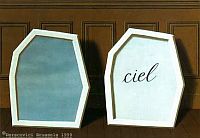
Figure 1.3 The Palace of Curtains (1929)
Here a frame containing the word ciel ("sky")is placed next to a frame filled with a blue sky texture—an image of "sky". Both are representations, one working by resemblance and the other by arbitrary association.
Larger, multiframe compositions are possible suggesting parts of a world or items in a list. Magritte gives us two pieces entitled "Empty Mask," one with words:
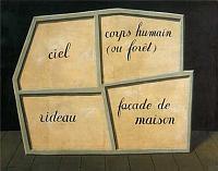
Figure 1.4 Empty Mask
and one with images:
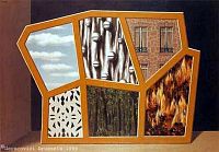
Figure 1.5 Empty Mask
There is some uncertainty about Magritte's titles, but it is worth comment that both assemblies are called "empty," perhaps for different reasons. That is, it is easy to see the absence of images in the the first version as the emptiness of the frames, but in the second, the mask is still empty because all masks are empty, at least those that do not represent anything, that are merely a decorated screen. Here Magritte may be playing off of the "frame" convention: these segments can't represent because they are not presented in proper rectangular frames. Didier Ottinger quotes Bart Vershaffel: "The dividedness, the fragmented quality and the separateness of their components deprive them of anything that resembles reality, destroys all narrative content" (Ottinger, 70). Ottinger speaks of these elements as "phonemes" of Magritte's new figurative language: the windows in a brick facade, harness bells, nude torso, forest, and clouds reappear in many different combinations in the paintings of this period and occasionally over the next decade or so, as if offering examples of what can appear with what (24).
There is a similar, more rectilinear one that does have a human figure in it in place of the patterned cutout:
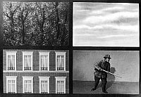
Figure 1.6 Fixed Idea (1927)
The figure of a hunter does alter the mix, but the representation of him is as stylized as it would be for a playing card and, like all the assemblies, the figure is placed a foot or so in front of a blank wall illuminated from over the viewer's left shoulder and with low horizon line. These bits of surfaces, even the hunter, begin to look like tokens in some game we don't know the rules for, or samples of "background" images for Web pages. They could all be made to tile very nicely. (Magritte was making his living designing wallpaper at the time.) These images are all very flat even though framed, and framing suggests a window being looked into. This is one of the ways Magritte "paints representation." The purpose of the array is not to present alternatives for us to choose our favorite from (like a book of wallpaper samples) but to make them equivalent; so they are pages from the sample book of representation through resemblance. To be sure, not all the wallpapers resemble some general and familiar thing: the harness bells on corrugated galvanized sheet metal are hardly a common figure of daily life. It is one more instance of Margritte's asymmetry: so often his sets include one member that looks like the other members of the set but is not.
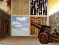
Figure 1.7 The Threshold of Freedom (1929)
There are a few others in this series, including the final image of Berger's book, "The Threshold of Liberty (1929)," which does break the single plane with a kind of triptych effect and includes the image of a 15cm howitzer aimed vaguely at the upper left panel, the naked female torso (femme nue).
I don't see this, pace A. M. Hammacher (76), as aimed at the woman's torso so much as at the panel assembly as such—"Liberty" in other words, would be to blast signs to oblivion and encounter unmediated things in themselves. (Recall the title to Figure 1.3: "The Palace of Curtains.") That would be at least approximately right to serve as the end of Berger's book, where the picture follows several paragraphs on the appropriation and debasement of art by advertising ("publicity"). And it does get us a bit farther in the right direction than Sylvester's conclusion that "the cannon is there to impress" (232), or for that matter Hammacher's remarks on the "eroticism" of the torso, forest, and wood grain. Indeed, the whole tendency of this set of experiments is to bracket or suspend representation for these "textures"—they represent nothing, they have become opaque, and hence do not bring in such associations as we may have with wood planks, fire, forests, etc. This painting, and the others, maintain the equivalence and interchangeability of the textures as textures, not their sensual differences and particularities as things.
This is an important principle for artists who paint representation in this "meta" fashion: we do not think of being outside on a fair day, or feel that we are, when we see a framed piece of blue with puffy white shapes on it propped up against a wall. The beginning of associations and feeling tones associated with things is that we imagine ourselves to be in the presence of the thing, but with these paintings, we are always reminded that we are in the presence of . . . a painting. The eye is not fooled; Magritte's way was not that of Dali.
In 1937, after having moved beyond the flat space into perspectival representation, Magritte revisited these textures one last time:
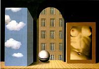
Figure 1.8 Violation (Attendat)(1937)
This is a textbook perspective example with converging parallels and shadows from a light source high over viewer's left shoulder. The three swatches of wallpaper now occupy different planes, two located within a "room" and the third visible through an arched passage through an exterior wall. As the title says, however, there is a violation in the composition taken together: the sky cannot appear as a surface of a block inside the room—a reflection of the sky in a mirror-surfaced block, yes, or a projection onto the block, but not simply the sky appearing through an opening (which is the value it has throughout this series). A swatch of blue and puffy white can only represent "sky" in certain contexts; there is, then, a syntax of graphic signs, and this picture is a violation on the intended reading. Further, there is no daylight illuminating the scene from the "sky" nor from the arched portal to the "outside." Magritte became quite fascinated with this grammar of sky and did a whole series of sky swatches projected onto displaced and discontinuous planes, anticipating the powers of modern image processing programs. (See, e.g. "The Universe Unmasked" 1932, "The Marches of Summer" 1937, " "The Poetic World II 1939, "Wasted Effort" 1962; only in the latter of these does light come from the sky.) Here, since resemblance fails at the level of the composition, ( i.e., the picture is ungrammatical), we may become aware of the rule that is being thwarted, and so the picture paints representation once again.
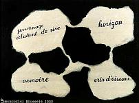
Figure 1.9 Living Mirror (1927) Concept blobs
Returning now to the main theme of images and words, we note that Magritte did not always keep them in separate frames but tried various ways of combining them in one. Words in a text frame are merely text, but in a visual frame (say one, minimally, with a horizon or directional lighting) they become elements in a visual array. He tried putting them in connected chambers of some biomorphic system of burrows (Figure 1.9). (See "Tree of Knowledge" (1929) for another connected blob set. )
This canvas with labelled areas begins to look like a sketch for a composition, and he even drew a visually punning picture of a person breaking out in laughter (a shattered image of a laughing face) but painting in the bird calls might be a real challenge and would explain why this "plan" was never executed.
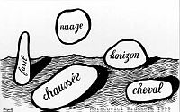
Figure 1.10 The Uses of Speech (1)(1927)
Alternatively, words might be enclosed in more substantial blobs with edges and shadows:
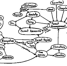
Figure 1.11 Eco- concept map
Of course, all words receive this treatment, even nuage which certainly should be left cloudy, and horizon, which isn't even an object at all. As a variation, in "The Use of Speech" of 1928, the concept-blobs have soft edges but do cast shadows and bear word-labels connected to them with lines. Blobs with shadows (or connections) do not look so much like place holders, indicating where the image will go, as they do concepts, the very sense of the words themselves (He uses blobs to represent word senses in "Words and Images.") Because word senses are abstract, they appear formless in a visual frame—formless, but substantial. This is indeed one attempt to make thought visible (as thought). The connected, labelled blobs of the period are the precursors of semantic and conceptual network diagrams (and of "concept maps") where the concepts are often drawn in as labelled ellipses or circles. Concept maps articulate the relations among the blobs as networks (directed graphs) rather than as configurations in space. Conceptual space is of course a common metaphor, but the concepts in conceptual space don't rest on the ground and cast shadows.
Thought blobs have been revived in art by the Conceptual artist Joseph Kosuth. In the catalog of the Montreal Museum of Art exhibit of 1996 , one finds reproduced four very large thought-blob compositions by Kosuth with the title L'essence de la rhétorique est dans l'allégorie. The blobs are black with white , cursive lettering, and in each composition six of seven of them are scattered on a slate green field. They contain the words non-lieu, représentation, chose en soi, forme au discours, similtude ("noplace, representation, thing in itself, shape of language, similitude"). The concept blobs in the other pages are equally attuned to the thematics of Magritte's blob series and constitute a very penetrating revival of his project. This is the same Kosuth who exhibited a chair, a picture of a chair, and a placard with a dictionary definition of a chair with the title One and Three Chairs (1965: the year of a major retrospective exhibit of Magritte's work in New York; the installation is now in the Georges Pompidou Center in Paris). The problematic, and the use of art to expose (rather than resolve) it, provide as clear a case of continuity as one will find in art.
Here is another, somewhat later canvas with the title "The Use of Speech" (1928) which has a very different look, but continues the word-in-blob theme by connecting up with the cartoonist's balloon:
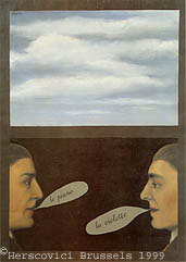
Figure 1.12 Use of Speech (1928b)
Here the convention appears to make everything perfectly normal, except that the exchange, however Saussurean it looks, is neither in sequence nor sequential: le piano | la violette. David Sylvester suggests this depicts Magritte and Breton playing a surrealistic word association game, which is one "use of speech" but again entirely nonrepresentational.
Alternatively we might begin to place images in place of the blobs:
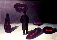
Figure 1.13 The Apparition (1928)
"Apparition" has the oblique force Magritte sought in his titles: which is the apparition—the landscape filled with blobs (to the man) or the man himself in a country of word-blobs? This painting is also reproduced in the English translation of Foucault's Pipe as "Figure 18: Personage marchant vers l'horizon".
Magritte varied the mix in several canvases of the period, including "Living Traces" (1927), where the blobs are unlabelled but there is the image of a tree on the right side with the words "femme nue" on its trunk, "Swift Hope" (1927) with labelled blobs, horizon, and no shadows.
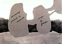
Figure 1.14 Lost World I (1928)
David Sylvester (192) lines up two versions of "Lost World," another in the series of labelled concept blobs. The first version has a horizon and a bit of landscape in the background, which is replaced in the other with the word paysage ("landscape").
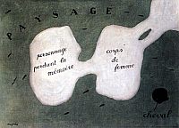
Figure 1.15 Lost World II (1928)
Here the image of the landscape gives way to the word, spread out as a landscape should be, and we pick up the ubiquitous cheval. This is like watching the process of abstraction, or a translation from depiction to description. Clearly, for the picture, something is lost. These lost worlds, however, also remind us of the advantage of words, namely, it is a little hard to imagine what picture we could insert to represent personnage perdant la mémoire ("person who is losing his/her memory.") Magritte both suggests the intersubstitutability of words and images as alternative signifiers and destabilizes the equivalence. This is perhaps most overt with the tree image of "Living Traces" with the label "femme nue" on the trunk, but it is at work in the bird calls of "Living Mirror," in "Lost Worlds" and again in the Key to Dreams series.
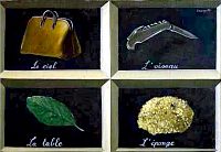
Figure 1.16 Key to Dreams (1927)
Titles/captions/labels
In the Key to Dreams series, Magritte returns to one traditional and stable way that words and images can share a frame, namely with the word as name or legend of what is also depicted in the fashion of vocabulary flash cards or early reading workbook sheets.Pierre Sterckx says they are images from the Petit Larousse, (52). Not just an equivalence of word and thing, but an exact match is implied.
It is, as Sylvester says, a school reading primer gone wrong(168)—but, as so often, not completely wrong, the lower right-hand cell is correct.
A six-cell version of 1930 is even less helpful for French I:
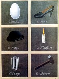
Figure 1.17 Key to Dreams (1930)
None of these nouns (the acacia, moon, snow, ceiling, storm, desert) match up. The problem infects English vocabulary sheets as well:
Figure 1.18 Key to Dreams (1935)
This version, like the first of its French counterparts, has a correct lower right-hand corner cell, and includes the hard-to-depict "wind." (This adorns the cover of the Penguin edition of John Berger's Ways of Seeing.) A title for Magritte seems to refer to the concept of a work, allowing there to be several canvases realizing the concept bearing the same name. And to be sure, "Key to Dreams" (La clef des songes) —is it just this deflection, this swerve away from standard assignments and displacement within the system that founds the semiotics of dreams? However that may be, these vocabulary sheets are also violations that provide a way of seeing how early schooling teaches us canonical recognition forms both of language and visual representation. Note that the English version is also a slight, overly literal mistranslation: the schoolbooks do not use the definite article in such contexts. But the side-, eye-level views of the objects, their lack of extraneous detail such as labels or decoration, and their presentation floating in a dark, featureless space without shadows (at least for the French versions) conform to the rules for 'image of a class of objects' that are part of our common visual culture. It is clear that for all his attention to surfaces, Magritte is not interested in photorealism: the intense particularity of actual concrete objects is not to his purpose.
This is certainly not to say that photography could not be used to explore representation in Magritte's fashion. Jerry Uelsmann has perfected the technique of printing pictures composed of more than one negative to create weirdly blending one-in-the-other objects like clocks and houses emerging from tree trunks, eyes, sky, and hands in odd places and out of scale, hard-edged objects suspended in a vague sort of space (and not located in any particular place). In all of these respects, Uelsmann extends Magritte's techniques into seamless, highly polished black and white photography. [10]
Figure 1.19 from Horne, 1998, p. 112
In what appears to be a remarkable coincidence rather than influence, Robert Horne creates a somewhat similar composition using clip art and words in order to show that in "Visual Language" the words must be integrated with the images and not merely juxtaposed. Horne's example is more like an intelligence test gone awry than a word book. Because it does not present words and images as aligned pairs, it is open to the viewer to try different groupings of images and/or words that might be said to belong together (according to some story or principle the viewer could come up with). He points out that one might try groupings on the basis of silhouettes or typography or other visual traits, and thus the puzzle or conundrum posed by this graphic does not lead to the issue of representation (and the similitude of the thing to what it represents) but to the issue of similitude of forms.
This comparison highlights another of Magritte's pictorial qualities: the clip art is two dimensional, monochrome, and lacking in visual detail (silhouettes are the extreme of this kind of flattening and abstraction). These qualities make them abstractive and typifying and also mark them as throw-away graphics, not art. Magritte in contrast paints as if he expects you to linger. He greatly valued making objects mysterious or numinous, and hence his rather fully rendered objects are not throw-aways.
Figure 1.20 Trahison des Images (1929)
We come now to the most famous of Magritte's text-image groups, the core of which all bear the title The Treachery of Imagery ("La Trahison des Images"). Their key image is that of a bent tobacco pipe (side view, as always) in combination with a sentence "This is not a pipe" ("Ceci n'est pas une pipe") done in the (usual) school cursive script ("a script from the convent" Foucault calls it).
I fail to see what is to be gained by translating Le Trahison des Images as "The Betrayal of Images" as is often done. "Treachery" makes it clear the images do the betraying and is the title of the American-exhibited version. Here the words are a declarative sentence which apparently corrects anyone who thinks this is a pipe. And this? Presumably the image—a sort of General Semantics point that the image is not the thing? Too simple and elementary, Foucault says. And besides, is this common way of speaking so misleading? Isn't it common enough to insert "picture of" where necessary, so that we do not tediously and pedantically have to say "This is a picture of my son, this is a picture of our dog," and so on. Actually, Foucault is most fond of a late version in which this painting is represented as resting on an easel with a large pipe (no, no, image of a pipe) floating in the air above and in front of it (title: "The Two Mysteries" (1966)). So why do we assume that there is more truth in the words than in the image? That the words can comment on the image, but not vice-versa? Or, Foucault suggests, the sentence's this could refer to the sentence itself: "this (sentence) is not a pipe; look, here's a pipe." This would be images taking primacy over words. One semiotic rule exposed here is that legends or captions refer to the visual contents to which they are attached, not to themselves. A second point is that legends and captions stand outside the interpretive area of the work; they are authoritative and exempt from the full play of interpretation.
So would it help to nail (or screw) the sentence down as a legend or caption? In subsequent reworkings, Magritte painted it as on a brass plaque screwed onto a wood mounting board for the pipe, and also sketched it as a screw-down plaque with the slightly updated message "This is still not a pipe" in 1953. That would seem to mute the self-referential reading ("this brass plaque is not a pipe" or "this whole assembly"), but it proliferates a new one "this is the famous pipe of which it was said 'this is not a pipe.'" Clearly this setup is rife with post structuralist indeterminacies—treacheries?
Figure 1.21 This is a Piece of Cheese (1937)
Magritte branched out to other objects, painting not long before his death a quite photo-realistic greenish apple with the caption "This is not an apple" (1964). But cheese, now there is a different matter:
This counterpart to the pipe dates from 1937. One might say the lesson is that context rules, but the title's affirmation is paradoxical, in that nothing looks less like a piece of cheese than this little framed miniature substituting for something you could eat. This affirmation, by the way, is not part of the picture (i.e., within the frame) as it is in the pipe series and apple; rather, it seems more securely rooted in the titling conventions which rule out its being taken as a part of what is represented. So its privilege is manifested by its being obviously false.
Titles: As long as images represent things (objects, places, people, events) , it made sense to identify what was represented by its verbal coordinates, as it were. This naming enables viewers to recognize the thing, or correlate it to other representations of the thing, and to admire the likeness or the rendering of some part of the world. This standard practice does not so much enact the primacy of language over image as it does confirm the function of the image as representing. When in the twentieth century an artist decisively abandons representation in favor of "abstraction" or a focus on formal values and medium, the title represents the image itself, usually in terms of its main compositional features ("Red Square and White Square", "White Balancing, 2" "Improvisation: Green Center"). When representation is itself under scrutiny, the titles tend to become oblique and sometimes teasingly definite references to things that are not part of common knowledge or experience, allusions to things in a code we don't share (Duchamp: "The Bride Stripped Bare by her Bachelors, Even", Ernst: "The Robing of the Bride"—just to take "brides").
Clearly Magritte's titles fall in this third, loosest of categories. A. M. Hammacher provides a valuable sketch of Magritte's titling practices, which crucially involved soliciting suggestions from his circle of mainly literary friends for the title of a newly completed work. He gave them guidelines and discussed suggestions with them in letters; among his papers was one "concerning titles" that reflects his thinking. He sharply rejected titles of the first kind, which he called "indicative," seeking rather the "poetic" title which was not identifying or determinative, but surprising and enchanting (Hammacher, 22). Most of the titles we have seen would be examples of poetic titles. A few of his titles are dead-pan literal descriptions of what a painting represents ("The Man with a Newspaper", "The Empty Picture Frame"), though even these are contestable, given the alert ingenuity his more characteristic titles call forth. The Man, for example, only appears in one of the four panels of that painting and the picture frame is not exactly empty: visible through it is a section of brick wall, though the frame is shown hung over a plastered wall, so that its emptiness is so intense, as it were, that it penetrates the plaster immediately behind it to expose the brick.
Though strangely methodical and persistent, Magritte's probings and comparisons of visual and verbal representation do not of course count as philosophical inquiries into the theory of signification. Though through his working of incongruities, he poses problems, he makes no attempt to solve them. His pursuit of topics like the dependence of representation on framing and the equivalence/nonequivalence of words and images has an almost empirical feel to it, as again and again we are presented with paintings that cause our expectations of correlation and consistency to tremble, almost as if the effect on us is to be measured, each one varying just one parameter. The paintings we have looked at have no subject other than these probings, this sly trickery, that produced the images of representation upon which his enduring popularity rests. He is the first visual semiologist.